Intel TrueVR
Role: UX lead
Team: Account director, Project manager, Creative director, Art director, 3D designer, 3 Unity developers, Technical analyst, 2 QA engineers
Timeline: 2016-2017
Intel came to POP in October 2016 with an urgent ask. They had recently acquired a VR startup called VOKE that specialized in on-demand 180-degree streaming of sports and entertainment. The existing VOKE app (later renamed Intel TrueVR) was in need of a refresh, as Intel CEO Brian Krzanich planned to give a keynote at CES to unveil his VR/AR strategy. Intel wanted to feature the new VOKE app in the presentation, by placing 200+ journalists in-headset to experience immersive sports themselves. Intel needed us to redesign and redevelop the VOKE app from the ground up, in two phases, the first for the CES stage in January 2017, with the second as launching the new app for users in the Oculus store in May 2017.
Discovery: Aligning Stakeholder Goals with User Benefits
We kicked off in mid-November, our team of 10 flying down to Santa Clara, CA for a 4-day Sprint 0 workshop. I sensed there would be potential challenges with the different stakeholders, so I led the first workshop day. Though this was a production-heavy project, I knew it was important for us to align on user insights, as that would provide us a North Star amidst the work, so the first workshop day served as a sort of Discovery crash course. I ran exercises and facilitated discussion amongst 20+ stakeholders to:
Gain understanding of what worked and what didn’t across competitive and comparative experiences
Define the benefits provided to the user by the app
Validate my own assumption of the target user (for whom I had created a proto-persona based on an earlier client briefing as well as AudienceView research)
I confirmed that our target user was a sports enthusiast and tech early adopter, keen to try keep up with the latest developments in tech and express their sports fandom in new ways. I also reinforced that the app’s largest benefit was to enable the user to “teleport” and watch the game from different vantage points on-demand, an ability not possible at an actual sporting event or standard broadcast.
I also confirmed use case considerations with client: since we were targeting mobile VR users, we could assume that users would be stationary, perhaps sitting on a couch or chair, which could minimize their ability or desire to twist around. Though mobile VR enables 360-degree action, this meant we could assume users would largely face forward within 60-degrees.
Challenges: Iterating on the Prototyping Process
While on-site with the client, our creative director and I whiteboarded and sketched on templates which outlined where content/UI would sit in relation to the user’s area of focus. After we returned to the office, I had a few days to prototype before we kicked off development in Sprint 1. I resorted to Axure and wireframed the front-facing content/UI. This sufficed for early agreement with our client, as it allowed us to quickly communicate our recommended functionality for MVP. However, I also knew that a 2D prototyping tool, was not adequate for VR, so in parallel I experimented with different prototyping methods.
Coming from the world of traditional web/mobile design, I realized that I needed to develop a new understanding of the depth placement of content/UI: in other words, how do you determine what is foregrounded, midgrounded, and backgrounded for the user’s comfort? At that time, it was surprisingly difficult to find much research on this, so I tried to approximate my own depth design based on Alex Chu’s Samsung experiments and Google’s Design Lab.
I also had a desire to find a medium for VR prototyping that would open up design discussion and collaboration for the whole team, so I set out to build a life-sized prototyping station. I measured out physical depth translated from Unity depth units based on my research. However, what I didn’t realize was that depth cues read differently to the human eye in real life versus in digital immersion.
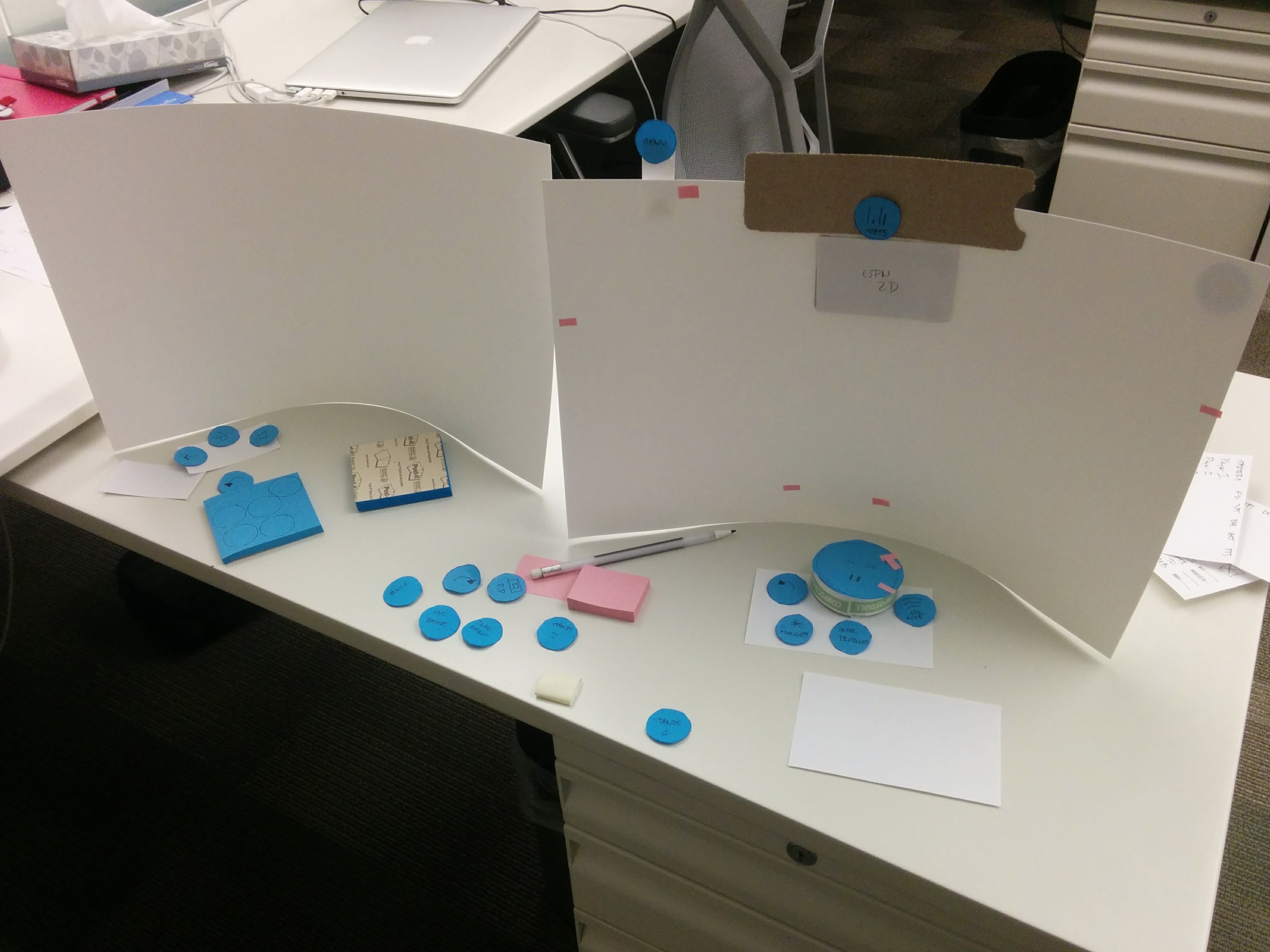
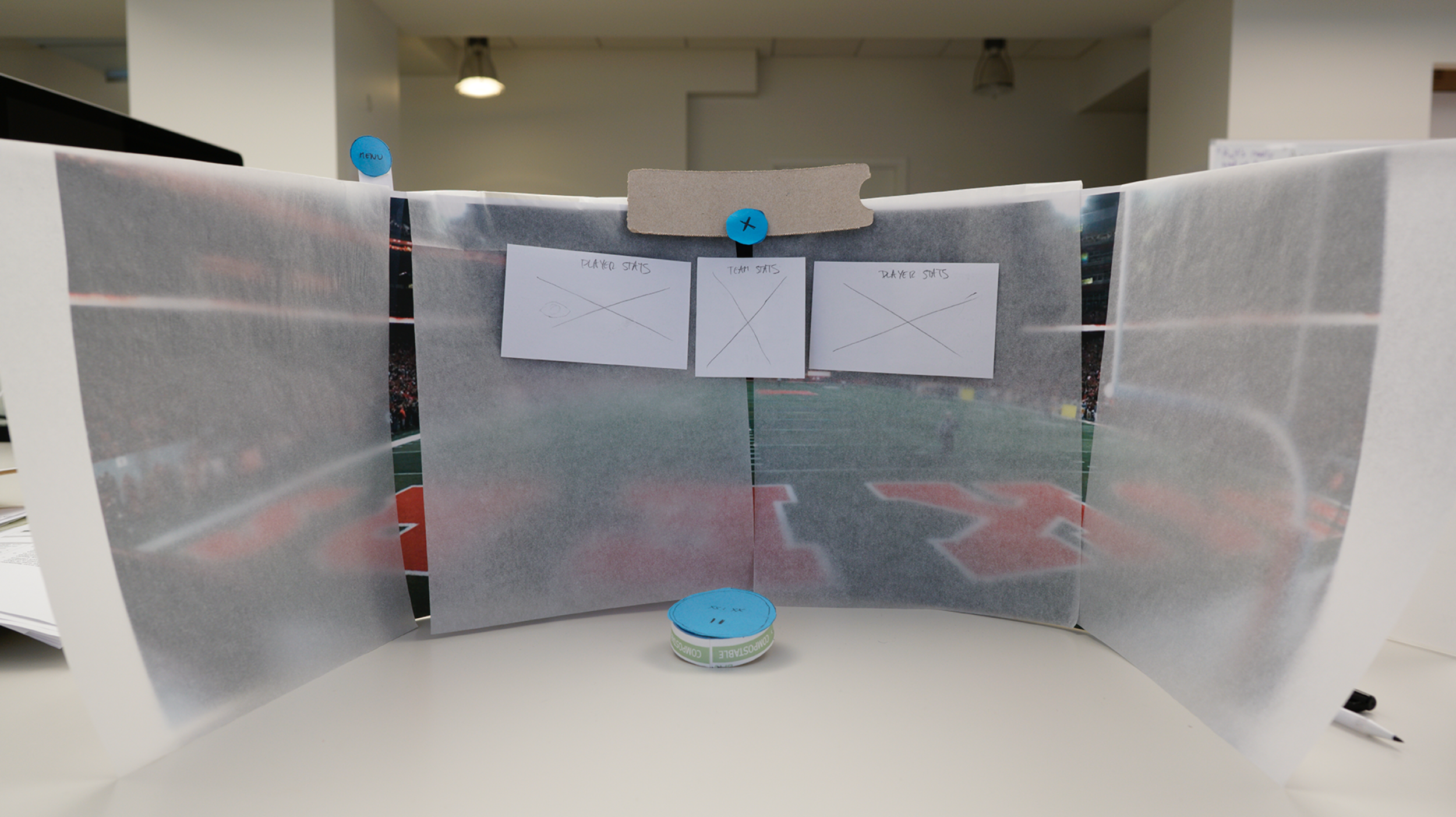
Life-sized prototyping didn’t convey the user experience accurately, so I changed to paper prototyping. I storyboarded a “desire path” that touched on the various functionality and states within the experience, then I got to work with scissors, coffee cups, Kleenex, whatever materials I could find. To communicate design decisions to my internal team, I acted out the paper prototype from the perspective of our target user, Greg the sports fan and early adopter.
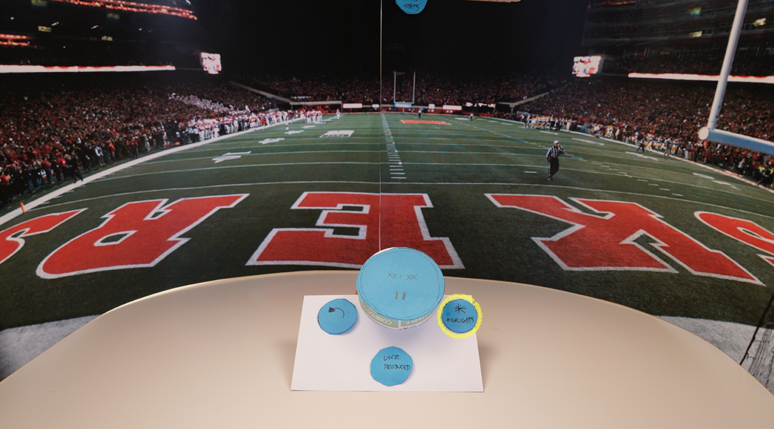
I then worked with my art director to photograph each state, then I created a Keynote “flipbook” to present to my remote client. The paper prototype was successful for a number of reasons: stakeholders understood my design decisions more easily, as opposed to other methods (e.g., whiteboarding, sketching, Axure, life-sized) which required more explanation, and since we had photograph artifacts of the paper prototype, it was clearer to the team what was visible and interactable for the user within their area of focus in-headset.


However, I still sensed a gap in my design prototype and what the developers built in Unity. I wanted to bridge this and work more closely with them, so I began taking Unity tutorials and even enrolled in a Unity For Designers course at Chronos Academy. This gave me the ability to pull down branches of the build from Git, work directly on the VR app, before pushing it back up to Git. In the instances where my Unity skills weren’t advanced enough, I would sit down with my developers, explain the user interaction I wanted to design as well as my rationale for how it benefited the user, so that they were bought into creating a C# script that I could apply myself in Unity.
Validating the Redesign of Playback UI
From the Sprint 0 workshop, I had gathered requirements around the extensive playback controls: the user needed to be able to play/pause the stream, skip and scrub forward/backward, switch/teleport camera views, flip to an Intel-produced stream, as well as access highlights/related content. At first, this manifested in the form of a long UI bar that stretched left-to-right. It also created visual clutter that detracted from the core experience, enjoying the game. Based on my knowledge of the user’s area of focus, I suspected this design would cause user discomfort, as the user would need to turn their head up to 60 degrees in each direction to use the playback controls.
I experimented with progressively disclosing the UI — in other words, I assumed that any time a user wanted to change their view/stream, they would look down to the playback controls anyway. In collaborating with our art director, I designed a radial playback control that revealed the timestamp. I positioned it obliquely towards the lower-quarter of the user’s vertical area of focus. When the user’s gaze drifted lower than the bottom ⅕ of the 180-degree video screen, I assumed their intent to change their view/stream, at which point the radial playback control would rise up and rotate slightly towards the user, surfacing secondary controls as well, for ease of access.
Please note choppiness is due to desktop recording
However, I had redesigned the playback controls based on many assumptions. Therefore I took it upon myself to conduct internal user testing (since user research had been cut from the original project scope). I recruited testers who identified as sports fans (not difficult given Seattle Seahawks pride) as well as early tech adopters, while also accounting for whether they had minimal or extensive (more than 2 hours cumulative) VR exposure. I discovered that the radial playback control enabled easy access, though it needed further refinement in execution.
Many testers found the playback control triggered too easily, rising up to meet their gaze when they did not want it to. I also heard many users express surprise at how quickly the secondary playback controls emerged. With my Unity knowledge, I was able to refine myself based on this feedback, before testing the controls once more with a different set of internal testers.
One of the many learnings I took away from the UX of VR is the tension point between user attention and user action. As a big fan of Steve Krug’s work, I discovered that his “Don’t make me think” ideology is a better fit for mobile/web experiences than it is for 3D experiences. Of course I didn’t want to make the user think about how to interact with UI in-VR, but I also found that it is a fine line in making design assumptions based on where the user is paying attention, for where the user pays attention does not necessarily correspond to actions they may want to take.
UX of VR Ownership
As the UX lead on POP’s first go-to-market VR experience, my responsibilities went far above and beyond traditional UX design for web/mobile, as I did what was needed to get client buy-in for a great user experience in a new medium. My other work also included:
Obtaining VOKE CEO buy-in on changing the dimensions and depth of the 180-degree screen based on user testing
Recommending in-headset software controls as a corollary to the on-headset hardware controls
Navigating the challenges of differing client opinions from both Intel and VOKE
Designing 3 different iterations of camera perspective UI
Defining app success metrics through setting up the Unity Analytics dashboard
Pushing back on feature bloat such as the request for Twitter integration
Advocating for future roadmap integration of multi-user social functionality


